
Stine Rosenbeck | 25/03/2021
5 user experience tips for small business websites
We are passionate about creating websites that not only look great but also deliver value and perform well. That’s why our website templates feature all the best practices of great user experience design.
In 2015, Microsoft commissioned a study that found that the average attention span of humans had decreased from 12 to 8 seconds since the year 2000. To put this in perspective, that is a second less than a goldfish.
Small businesses need to make the most of this small window of opportunity. Website visitors need to be engaged quickly and directed to where they need to go. Joe MacMillan of the Halt and Catch Fire show says, “computers [or websites] aren’t the thing. They are the thing that gets you to the thing.”
So, let’s get you to the thing. Here are some UX tips on how to make sure your small business website creates a great user experience.
Website performance and accessibility
Let’s start with the fundamentals. First and foremost, website load speed is the very first impression a visitor will get. Don’t leave visitors and potential customers waiting after they have rung the doorbell.
Back in 1993, UX legend Jakob Nielsen described how a 0.1 second delay in load time is the limit for the user feeling that the system is instantly responding; whereas the limit for the user to feel uninterrupted is 1.0 second, as the user sees the computer is working on the task but also notices the delay.
Want to check the load time of your website? There are online tools that you can use, like this one. Remember to use the 1.0 second threshold as a benchmark.
Another fundamental principle in 2021 is responsive design. Small business websites need to look great and work well on different devices, so visitors and potential customers can have a great online experience - whether they are on a laptop or mobile device. Make sure your website looks at least as good as it does on desktop, or you’ll risk losing out on potential customers.
Lessen the cognitive load
Steve Krug, a pioneer in usability engineering, has stated that it is important for UX designers to place as little cognitive load on users as possible. In other words, don’t make users think. Instead, create experiences that are intuitive and user-friendly, so users can easily navigate the site without added brain strain.
How do you lessen the cognitive load? One way is to put only the most important information in front of the user as early as possible. When working on the content for your website, you may be tempted to go into detail about what you offer. However, it is advised that you only provide enough information so the user can decide about your product or service.
Remember, humans have an attention span of 8 seconds. As a small business, you need to catch the user’s attention with your key offerings, not lose it with unnecessary details. Good design is not done when there’s nothing left to add, but rather when there’s nothing left to take away. Here are some good rules of thumb:
1. Decision fatigue: Stop it at the top
Keep your top menu to a maximum of 5 to 7 items, otherwise, your users will have a hard time deciding what to dive into. Remember, the time spent making a decision increases with the number of options available. Think of all the times you have tried to pick a movie to watch and it ended up taking too long.
2. Snackable, skimmable content
Don’t expect your users to read all your content from end to end. Today, users scan websites to get an overview of your content, often scrolling and navigating back and forth. Cater to this behavior by making sure your content has descriptive headlines and is separated into smaller paragraphs. Great copy is short, to the point, and speaks to your customers.
3. Show and tell
Use images and illustrations to break up content, as this serves to both accompany and enhance what is being said in the copy, as well as making it easier to navigate visually. Does your small business need help with great images for your site? You can find beautiful (and free) stock photos online, including the popular site Unsplash.
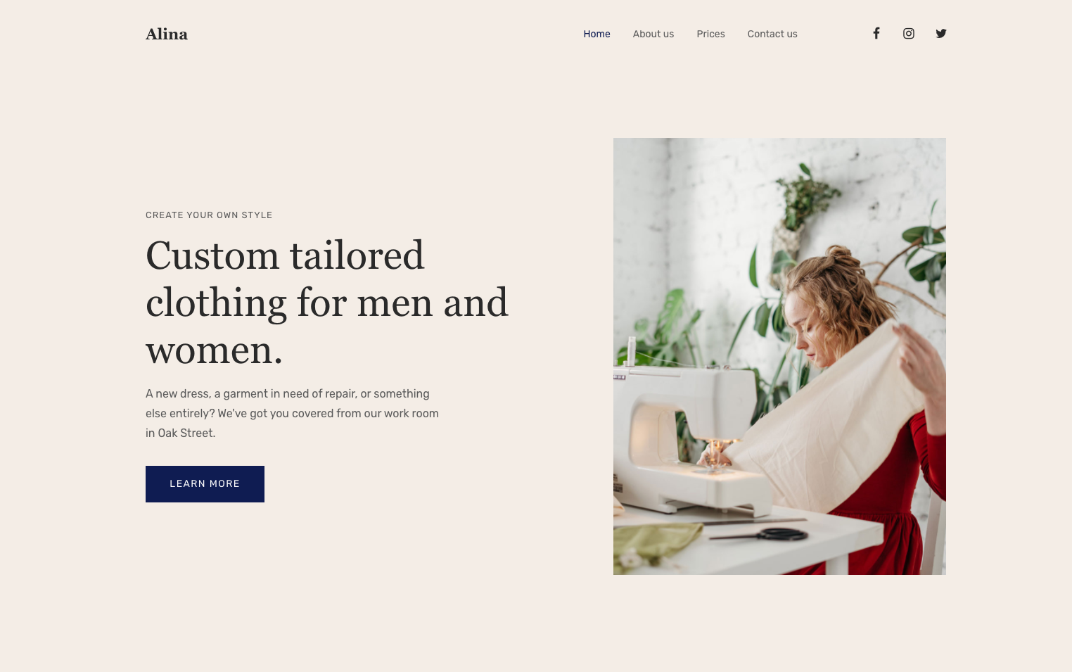
The above image is a screenshot of one of Mono Solutions' website templates. Notice how there are only four website navigation items and the text is easy to scan.
Light the way with calls to action
As small businesses only have the attention of visitors for such a short time, the website must have a clear goal. As an SMB, you may want visitors to get in touch for a quote or to see a range of handmade ceramics.
Whatever the goal, a strong CTA, or call to action, needs to be presented at the top of the home page. The CTA then directs or links, for example, to a contact form (to get a quote) or to the webshop (to see the ceramics).
CTAs on a website are like placing lanterns throughout a dark forest to light the way home. Always consider what the next step would be on your guest or customer journey and check to see if it’s easy to do. If not, you might need a CTA.
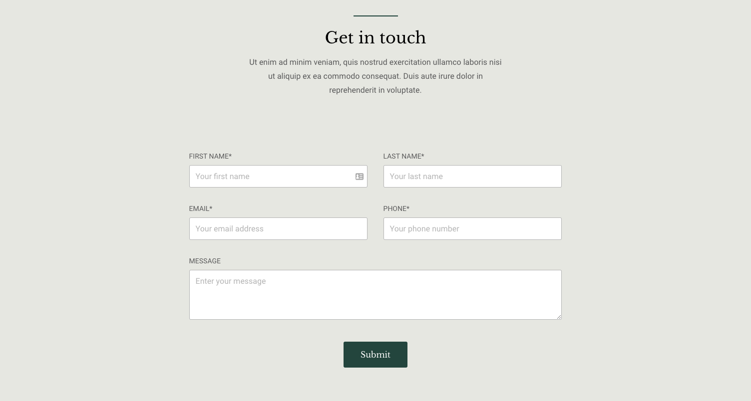
The above image shows a Mono contact form with a strong call to action button. Having a strong CTA will increase your conversion rate.
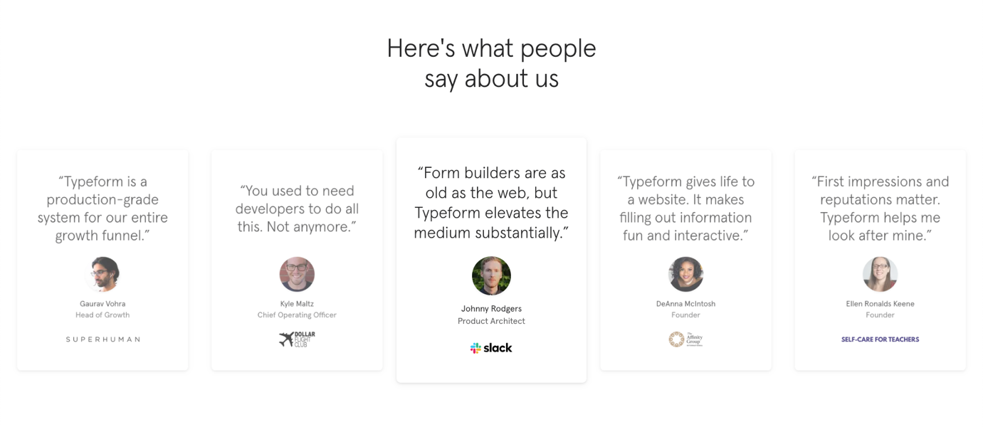
Use social proof
Your small business doesn’t have the marketing budget of a big brand, so most of your website visitors will have never heard of your brand. For these visitors, it is important to quickly establish credibility and build trust. A great way to do this is to feature social proof, such as customer logos.

If your clients aren’t of a size where potential customers would recognize the logos, a different approach could be to show client testimonials. A great testimonial shows what value a customer has achieved by using your product or service and information about the customer (name, title, company, and photo).
Get up close and personal
As a small business, more often than not, you are the product or the service, or at least part of it. Prospective customers want to know the person behind the product or service. This is a great opportunity to do a bit of brand building and storytelling.
An ‘About’ page on your website is a great place to include an image of yourself, talk about what motivates you, and why you are passionate about what you do.
In conclusion
A great user experience is composed of a lot of small design, technology and content decisions. And thinking like your customer isn’t always as easy as you would think. If you have the opportunity, always test your website design with someone from your target audience.
Ask questions, pay attention to how website visitors scan your pages, what they notice and linger on, what impression the content leaves, and if your CTAs are working as intended.
Many are often surprised when they discover what’s working and what’s not. Mono Solutions have incorporated all these best practices into our templates, making it as easy as possible to get a beautiful website with a great user experience.
About the author
Stine is passionate about crafting great experiences for people. Having worked 7+ years at several successful SaaS scale-ups, both as a product manager and a product designer, she knows how great user experience drives business. Stine is well-versed in both user experience design and product development. And as such, she will talk an equally long time about the beauty of a specific typeface, a great adoption strategy or a particularly interesting usage metric. Stine is currently employing her design skills at Mono as a product designer, seeking to help small, local businesses tap into their potential online.
